Artisan Bakery Co.

Designing a Digital Experience for an in-store bakery.

UI/UX Designer • Design System • Brand Identity • 4 Weeks

As customer engagement shifts to digital platforms, Artisan Bakery Co. recognised the need to move beyond its physical storefront. The goal was to create a seamless online experience that reflects the warmth and quality of the bakery, allowing customers to connect anytime, anywhere.

PROBLEM

Turning the bakery’s physical experience into a digital one that feels just as welcoming, warm, and full of quality.

SOLUTION

Bringing the Bakery to Life with Imagery

With my background in photography, I understood the power of imagery in creating an emotional connection. I curated a selection of images that reflected the bakery’s vibe, extracted directly from the project brief. Key themes like “high-quality, handcrafted baked goods,” “warm, rustic, and homey,” and “traditional” guided my choices. The imagery not only showcased the bakery's offerings but also set the tone, evoking the cozy, handcrafted experience customers associate with Artisan Bakery Co.

SOLUTION

Typography That Speaks to Tradition and Clarity

Choosing the right typography was essential to communicate both the bakery’s traditional roots and the need for clear, accessible information. I carefully selected typefaces that reflected the theme of “tradition” while using a clean sans-serif font to enhance readability. This balanced approach helped create an inviting and professional look, ensuring the content was legible and accessible for all users.

SOLUTION

Optimising Element Sizes for Better Usability

To improve usability and accessibility, I focused on larger copy and element sizes. This made the site easier to navigate, especially for mobile users and those with visual impairments. The use of bigger text and buttons helped ensure that every user could engage with the website comfortably, without feeling overwhelmed by small, hard-to-read elements.

REFLECTIONS

Finding the Balance Between Aesthetics and Accessibility

While I wanted the site to feel warm and inviting, I also had to make sure it was accessible. Initially, I focused a lot on the aesthetic side—colours, imagery, and fonts—without fully considering how they would affect users with different needs. Over time, I became more aware of how crucial accessibility is, and I adjusted design elements like font size and contrast to ensure the site was usable for everyone. Moving forward, I’ll prioritise accessibility from the very start of the design process.

Typography Is More Than Just Pretty Letters

At first, I underestimated the role typography played in conveying the bakery's traditional yet approachable vibe. But once I started testing different fonts and weights, I realised just how much it influenced the site’s overall feeling. Selecting the right typeface was key to maintaining a balance between tradition and readability. It was a reminder that every design element, even the smallest details like typography, plays a crucial part in setting the tone.

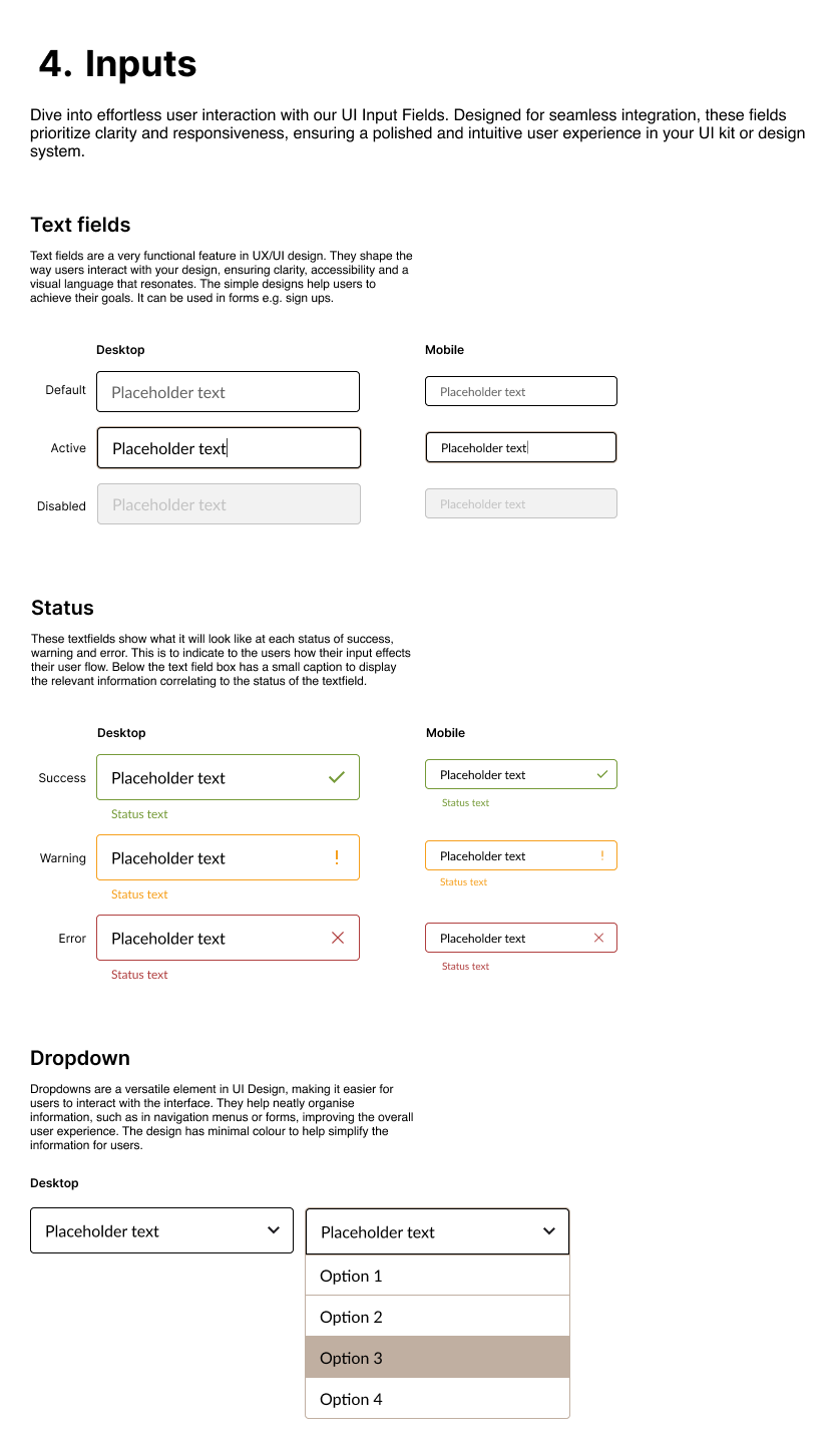
DESIGN SYSTEM

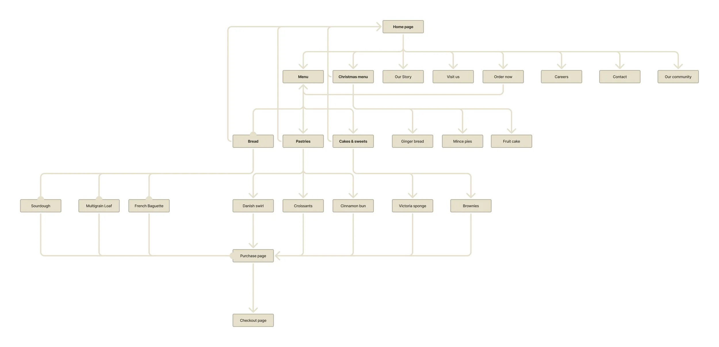
INFORMATION ARCHITECTURE

FINAL DESIGNS

Other Projects

Arctic Travels

Designing a Stress-free Booking Experience for Ski & Snowboard Holidays.

Meal Muse

Building a Design System for a Meal Planning App

Koach

Designing a Class Booking Experience for a Gym – A Personal UX/UI Project