Koach
Designing a Class Booking Experience for a Gym – A Personal UX/UI Project
Gym members often struggle with booking classes due to complex interfaces and unclear availability. My goal was to design a feature that simplifies class booking, ensuring a smooth, frustration-free experience.
UX/UI Designer
Competitive Analysis: Pure Gym App
I analysed key screens from the Pure Gym app to identify design elements that could be utilised or avoided for a better user experience.
Low-Fi Sketching & Crazy 8s Exploration
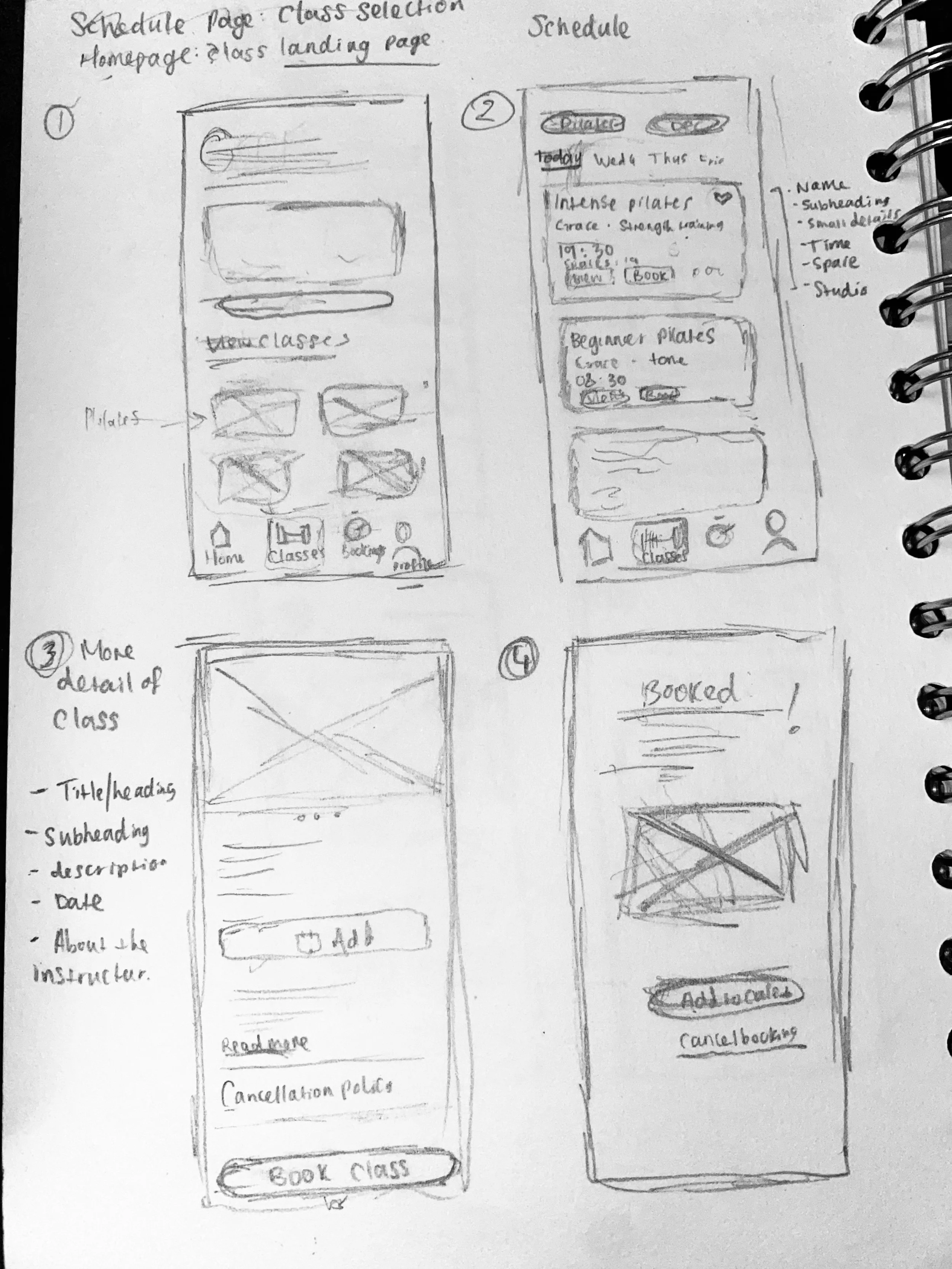
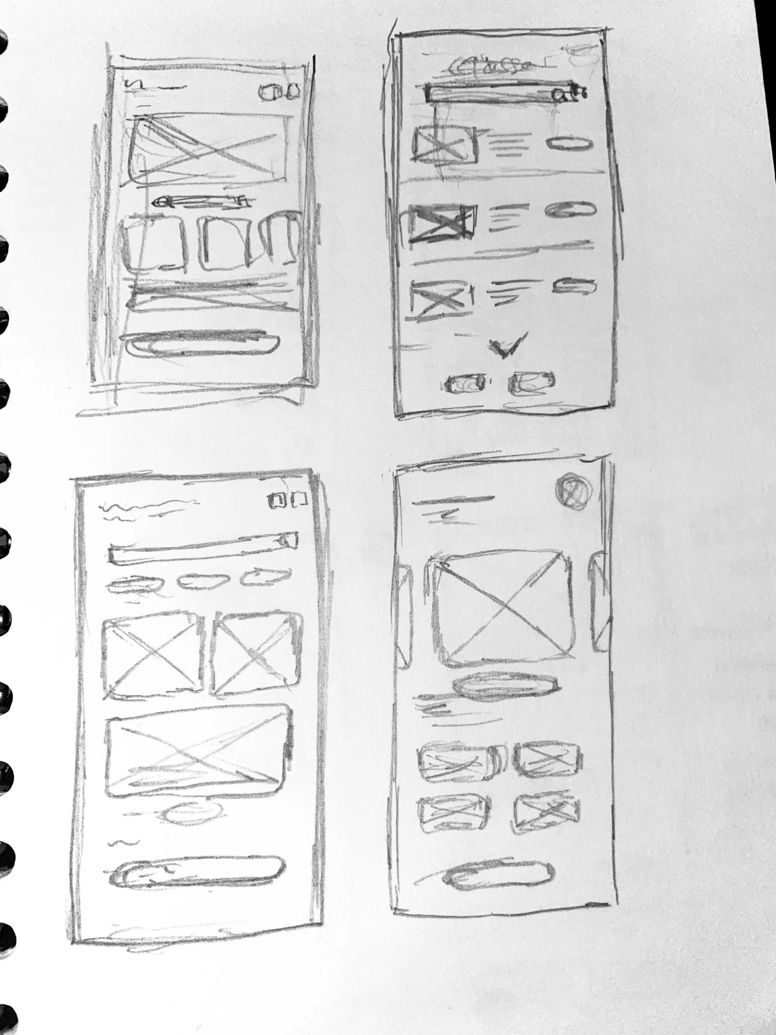
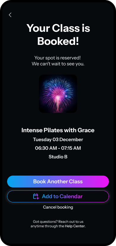
To rapidly generate ideas and refine the gym app's booking experience, I practiced Crazy 8s, a UX ideation technique that encourages quick sketching of multiple design variations. While traditionally done with eight sketches, I focused on four key screens to explore different layouts for the class schedule and booking flow. This exercise helped me reinforce the habit of iterative design, ensuring a strong foundation for the final user-friendly interface. I then sketched out four different screens: the homepage, selecting a class from the schedule, the class details page, and the booking confirmation page.
High-Fidelity Wireframes
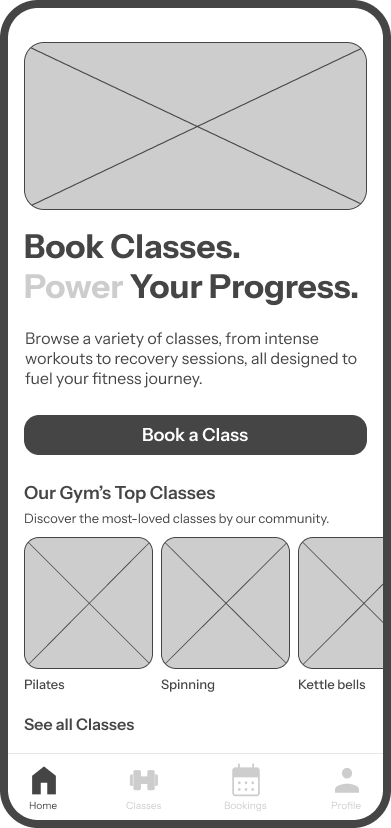
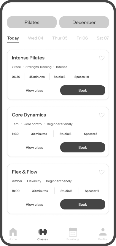
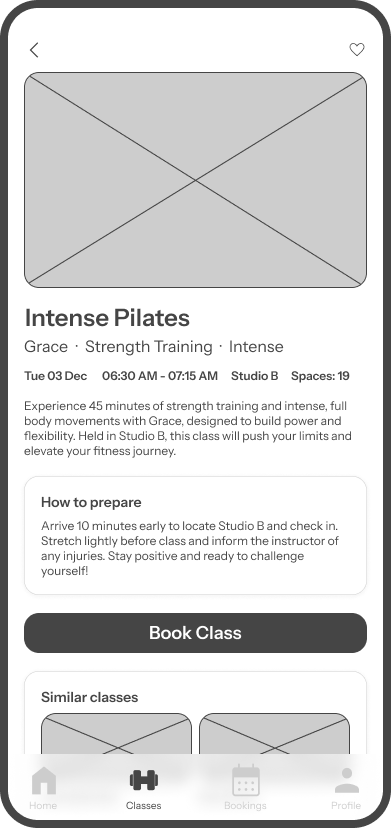
I analysed key screens from the Pure Gym app to identify design elements that could be utilised or avoided for a better user experience.
Final Prototypes
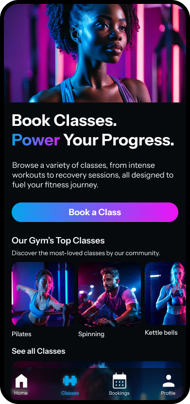
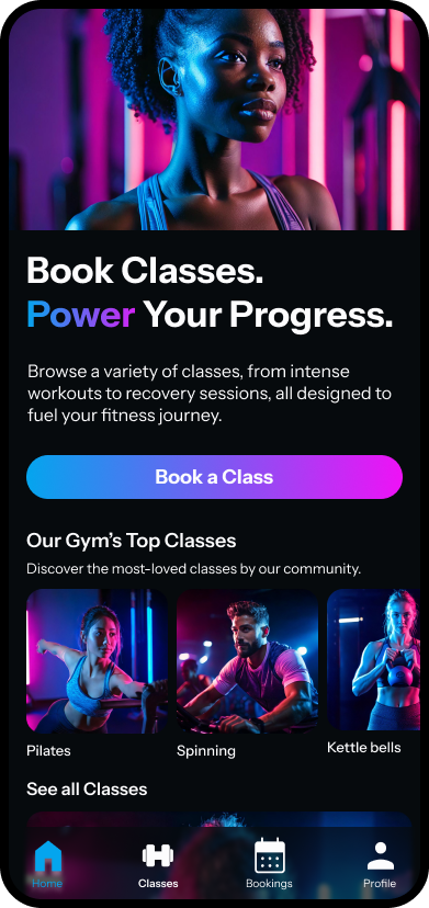
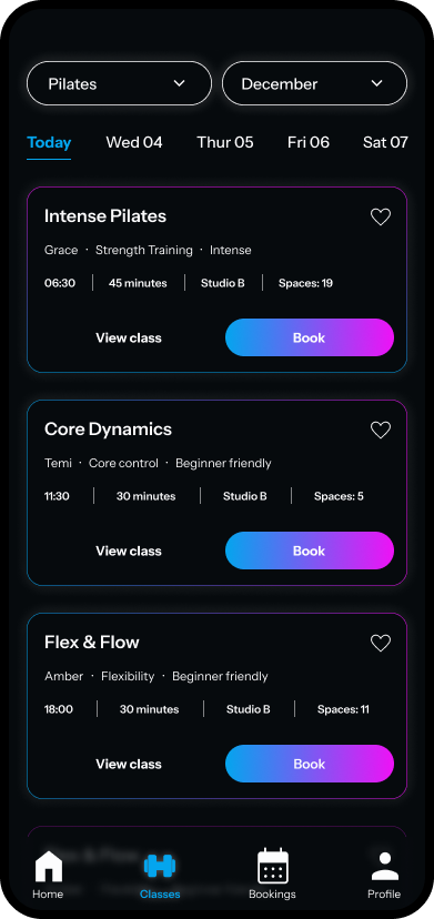
Bringing the gym app to life, I focused on creating a visually engaging and user-friendly interface. I enjoyed experimenting with the colour palette, combining blue and pink to emphasise a unisex appeal while ensuring inclusivity. To reinforce the gym’s energetic and powerful atmosphere, I incorporated dark tones, a common theme in fitness branding, and balanced them with a bold accent colour for contrast and clarity. This approach not only enhances aesthetics but also improves usability, ensuring key elements stand out for a seamless booking experience.

